Angular Animations
Matias Niemelä (@yearofmoo)
http:// yom.nu / ng-japan-2017


Animations

Matias

yearofmoo.com
Links / Slides
Slides = http://yom.nu/ng-japan-2017
Demo = http://yom.nu/ng-japan-2017-demo
Github = http://yom.nu/ng-japan-2017-code
Blog = http://www.yearofmoo.com
What to expect
Animations on the web
Basics of Animations in Angular
Overview of New Features
CSS & Web Animations
Animation on the web
How would you animate something
CSS ... Transitions? Keyframes?
A third-party JS library?
What about web-animations?
<div class="animate-me">
...
</div>
/* CSS transitions */
.animate-me {
transition:1s linear all; font-size:200%;
}
/* CSS keyframes */
.animate-me {
animation: 1s expandFontSize linear;
}
@keyframes expandFontSize {
from { font-size: 100%; }
to { font-size: 200%; }
}
The Web-animations API
Create animations using JavaScript
Native browser-level API
Basically keyframes in JavaScript
Chrome, Firefox, Opera and Safari (TP)
var element = document.querySelector('.animate-me');
var player = element.animate([
{ fontSize: '100%', easing: 'linear' },
{ fontSize: '200%' }
], 1000);
//...
//...
player.pause();
player.play();
player.cancel();
player.currentTime = 500; //50% between 0s and 1s
The disconnect from CSS
Web animations are all in JS
No stylesheets
No way to decorate animations
You need to specify every style!!!
Too low level
How Angular Does it
Angular uses web animations
Custom Animation DSL code
Integrates with the component
And is testable
// the same animation
import {style, animate, animation} from "@angular/animations";
const expandFontSize = animation([
style({ fontSize: '100%' }),
animate('1s linear', style({ fontSize: '200%' }))
]);
Animations in Angular
@angular/animations
Not enabled by default
Import BrowserAnimationsModule
Place animations in Components
// inside of your app module
import {NgModule} from '@angular/core';
import {CommonModule} from '@angular/common';
import {BrowserAnimationsModule} from "@angular/platform-browser/animations";
@NgModule({
imports: [
CommonModule,
BrowserAnimationsModule
]
})
export class MyAppModule {}
SystemJS
Include the following:
animations.umd
animations-browser.umd
platform-browser-animations.umd
import {Component} from "@angular/core";
import {style, animate, transition, trigger} from "@angular/animations";
@Component({
animations: [
// animations go here...
]
})
class MyComponent {}
Triggers, Transitions and Sequences
Triggers manage animation state
Transitions animate between states
Sequences are step-by-step animations
@Component({
animations: [
trigger('expand', [
transition('closed => open', [
style({ height: '0px' }),
animate('0.5s', style({ height: '100px' }))
]),
transition('open => closed', [
style({ height: '100px' }),
animate('0.5s', style({ height: '0px' }))
])
])
]
})
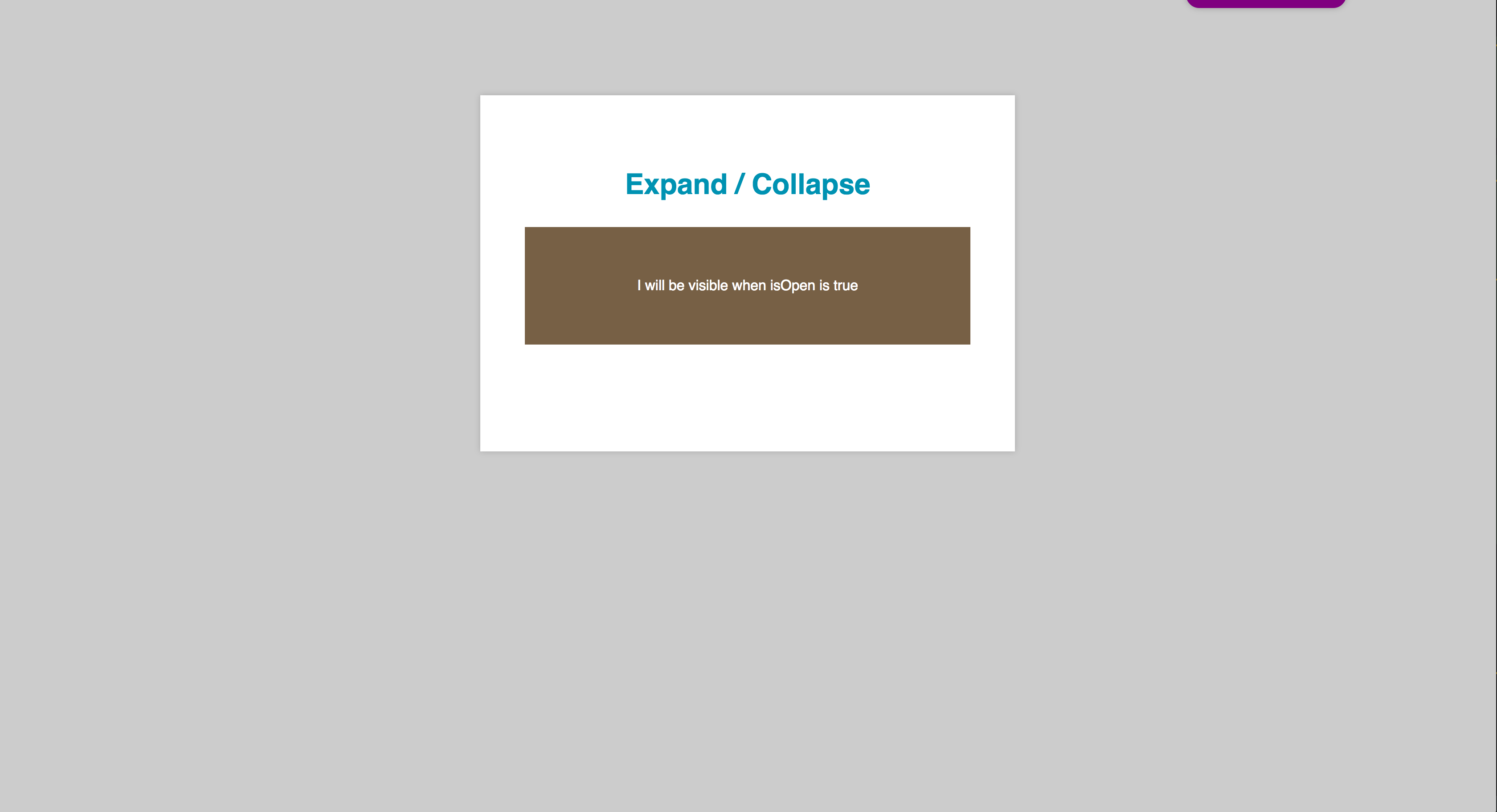
Animation Bindings
Triggers act as binding properties
Within the component template
Prefixed with an @ sign
<!-- component.template.html -->
<div [@expand]="isOpen ? 'open' : 'closed'">
I will be visible when isOpen is true
</div>
<button (click)="isOpen = !isOpen">Toggle</button>
Animation Events
Events can also be used
Detect when trigger starts/completes
Prefixed with an @ sign
<!-- component.template.html -->
<div [@expand]="isOpen ? 'open' : 'closed'"
(@expand.done)="animationComplete($event)">
I will be visible when isOpen is true
</div>
$event == {
element: any, // div element
fromState: string, // "in" or "out"
toState: string, // "in" or "out"
totalTime: number, // 1000 (milliseconds)
triggerName: string, // "fade"
phaseName: string // "start" or "done"
}
1
Trigger States
Transitions don't save state
Use state(name, styles) to persist styles
@Component({
animations: [
trigger('expand', [
state('closed', style({ height: '0px' })),
state('open', style({ height: '100px' })),
transition('closed => open, open => closed', [
animate('0.5s')
])
])
]
})
Auto Styles
Use * to specify the final style
Helpful to dynamic styles like height
Works on any CSS property
Use style('*') to reset everything
@Component({
animations: [
trigger('expand', [
state('closed', style({ height: '0px' }),
state('open', style({ height: '*' }),
transition('closed <=> open', [
animate('0.5s')
])
])
]
})
1
New Animation Features
Angular 4.2+
A wave of new features
querying, staggering
sub animations
input params
routeable animations
2
query() animations
Animation Querying
multiple element animation
find newly inserted/removed nodes
serial / parallel animations
staggering!
<!-- demo app / list-page.component.html -->
<div class="list-container" [@listAnimation]="items.length">
<div *ngFor="let item of items" class="list-item">
...
</div>
</div>
trigger('listAnimation', [
transition('* => *', [
query(':enter',
style({ height: '0px' }), {optional: true})
query(':leave', [
style({ height: '200px' }),
animate('500ms', style({height: '0px'}))
]), {optional: true}),
query(':enter',
animate('500ms', style('*'))), {optional: true})
]),
]),
stagger() animations
Staggering
query() animates elements in parallel
stagger() spaces them out
which looks nice
query(':leave', stagger(100, [
style({ height: '200px' }),
animate('500ms', style({height: '0px'}))
])), {optional: true}),
query(':enter', stagger(-100, [
animate('500ms', style('*'))
]), {optional: true})
animateChild() animations
Sub Animations
query() can find inner elements
that have animations
and use animateChild() to allow/skip
// some particular animation
query('@someAnimation', [
animateChild()
])
// all sub animations
query('@*', [
animateChild({ duration: '1s' })
])
2
<form [@searchBarAnimation]="state">
<div [@showHideAnimation]="state == 'loading' ? 'on' : 'off'">
<!-- loading animation -->
<div [@showHideAnimation]="state == 'active' ? 'on' : 'off'">
<!-- profile name -->
<div [@showHideAnimation]="state == 'search' ? 'on' : 'off'">
<!-- search field -->
trigger('searchBarAnimation', [
state('active, loading', style({ backgroundColor: '#333', color: 'white' })),
state('search', style({ backgroundColor: '#fff', color: 'white' })),
transition('* => *', [
//...
])
]),
transition('* => *', [
style({ height: '!', position: 'relative', overflow: 'hidden' }),
group([
query('@showHideAnimation', [
style({ position: 'absolute', top:0, left:0, right:0}),
animateChild(),
]),
animate('500ms cubic-bezier(.35,0,.25,1)')
]),
]),
animation { {substitutions} }
Animation Input Parameters
All style data is static
* styles are dynamic
How do we pass in data?
Animation Style Substitutions
trigger('heightChange', [
transition('* => *', [
style({ height: '{{ fromHeight }}' })
animate(1000, style({ height: '{{ toHeight }}' }))
], { params: { fromHeight: '0px', toHeight: '100px' })
])
Reusable Animations
const heightAnimation = animation([
style({ height: '{{ fromHeight }}' })
animate(1000, style({ height: '{{ toHeight }}' }))
], { params: { fromHeight: '0px', toHeight: '100px' })
Animation Style Substitutions
trigger('heightChange', [
transition('* => *', [
useAnimation(heightAnimation, {
params: {
fromHeight: '0px',
toHeight: '100px',
}
])
])
])
<div [@heightAnimation]="{value: heightState, {
params: { fromHeight: '33px', toHeight: '66px' }
}">...</div>
2
<app-modal
*ngIf="modalIsActive"
[startCoordinates]="{x: xValue, y: yValue}">
</app-modal>
@Component({
selector: 'app-modal',
templateUrl: 'modal.component.html
animations: [
//...
]
})
export class ModalComponent {
//..
}
export class ModalComponent {
public modalState: any = '';
@Input('startCoordinates')
public startCoordinates: any = {};
ngOnInit() {
const x = this.startCoordinates['x'] || 0;
const y = this.startCoordinates['y'] || 0;
this.modalState = {
value: 'ready',
params: {x, y}
};
}
}
<!-- modal.component.html -->
<div class="container" [@containerAnimation]="modalState">
...
</div>
trigger('containerAnimation', [
state('*', style({ display: 'none' })),
state('ready', style({ display: 'block' })),
transition('* => ready', [
style({
display: 'block', opacity: 0, transform: 'scale(0)', transformOrigin: '50% 0%', top: '{{ y }}px', left: '{{ x }}px',
}),
animate('300ms 200ms cubic-bezier(.35,0,.25,1)', style(['*', {transformOrigin: '50% 0%'}]))
])
])
route animations
2
Animations + Routes
Each route can have animations
Transitions = route changes
query() can dictate when they happen
export const ROUTES = [
{ path: '',
component: ListPageComponent,
data: {
animation: 'indexPage'
}
},
{ path: 'users/:slug',
component: ProfilePageComponent,
data: {
animation: 'profilePage'
}
}
];
<div [@routeAnimation]="prepRouteState(outlet)">
<!-- ... -->
<div class="router-container">
<router-outlet #outlet="outlet"></router-outlet>
</div>
</div>
Preparing the router state
The component reads the config
Returns the router state
Or creates its own value
class AppCmp {
prepRouteState(r) {
return r.activatedRouteData['animation'];
}
}
The Router Animation
The container handles the change
It can then tell children to animate
Or do its own animation
@Component({
selector: 'app-root',
templateUrl: './app.component.html',
animations: [
trigger('routeAnimation', [
transition('indexPage <=> profilePage', [
// 1. style the containers
// 2. run the removal animation
// 3. run the enter animation
])
])
]
})
transition('indexPage <=> profilePage', [
// 1. style the containers
query('.router-container', style({ position: 'relative '})),
query(':enter, :leave',
style({ position: 'absolute', top: 0, left: 0, right: 0 })),
query(':enter', style({ opacity: 0, transform: 'translateY(400px)' })),
//...
// 2. run the removal function
group([
query(':leave', animateChild()),
query('@searchBarAnimation', animateChild()),
]),
//...
// 3. run the removal function
group([
query(':enter', group([
animate('400ms cubic-bezier(.35,0,.25,1)', style('*')),
animateChild({ delay: '200ms' })
])),
query(':leave', [
animate('400ms cubic-bezier(.35,0,.25,1)', style({ transform: 'translateY(-400px)', opacity: 0 }))
]),
]),
])
Final Notes
Twitter = @yearofmoo
Slides = http://yom.nu/ng-japan-2017
Demo = http://yom.nu/ng-japan-2017-demo
Github = http://yom.nu/ng-japan-2017-code
Blog = http://www.yearofmoo.com
ありがとう!