ng2 + ngAnimate
yom.nu/ng-conf-2016-slides
Matias Niemelä
ng-conf 2016
Let’s talk animation …
What are our options?
CSS Transitions
CSS Keyframes
The WebAnimations API
Regular JavaScript
CSS Transitions
Element state changes
Auto style application
Controllable
Programmatic Access
CSS Keyframes
Animation Sequences
Simple, but limited
All styles required
Programmatic Access
Web Animations
Programmatic Access
All styles required
No stylesheet access
Browser Support
What ng1 Did
Lots of CSS
Some JavaScript
The browser knows all
DOM States
ng2 Does it differently
No CSS transitions/keyframes
Yes Web Animations
Borrows the philosophy
Timeline-based
Component States
Demo Code
All code is available at:
github.com/matsko/ng-conf-demos
Note: Old/new API
The Basics
<div @myAnimation="expression">
...
</div>
@Component({
animations: [
animation('myAnimation', [
transition('state1 => state2', [
style({ opacity: 0 }),
animate('1s', [
style({ opacity: 1 })
])
])
])
]
})
// hello-world.html
<button (click)="toggle()">Show/Hide</button>
<div @myAnimation="isOpen ? 'open' : 'closed'">>
hello world
</div>
// hello-world.ts
import {
Component,
state, animation, transition, style, animate
} from '@angular/core';
@Component({
selector: 'hello-world',
animations: [
animation('myAnimation', [
state('open', style({ opacity: 1 })),
state('closed', style({ opacity: 0 })),
transition('open => closed', animate(500)),
transition('closed => open', animate('0.5s'))
])
]
})
class HelloWorldCmp {
isOpen = false;
toggle() {
this.isOpen = !this.isOpen;
}
}
Component UI States
We use the "@" sign
Persisted styling
The Arc animates in between
1
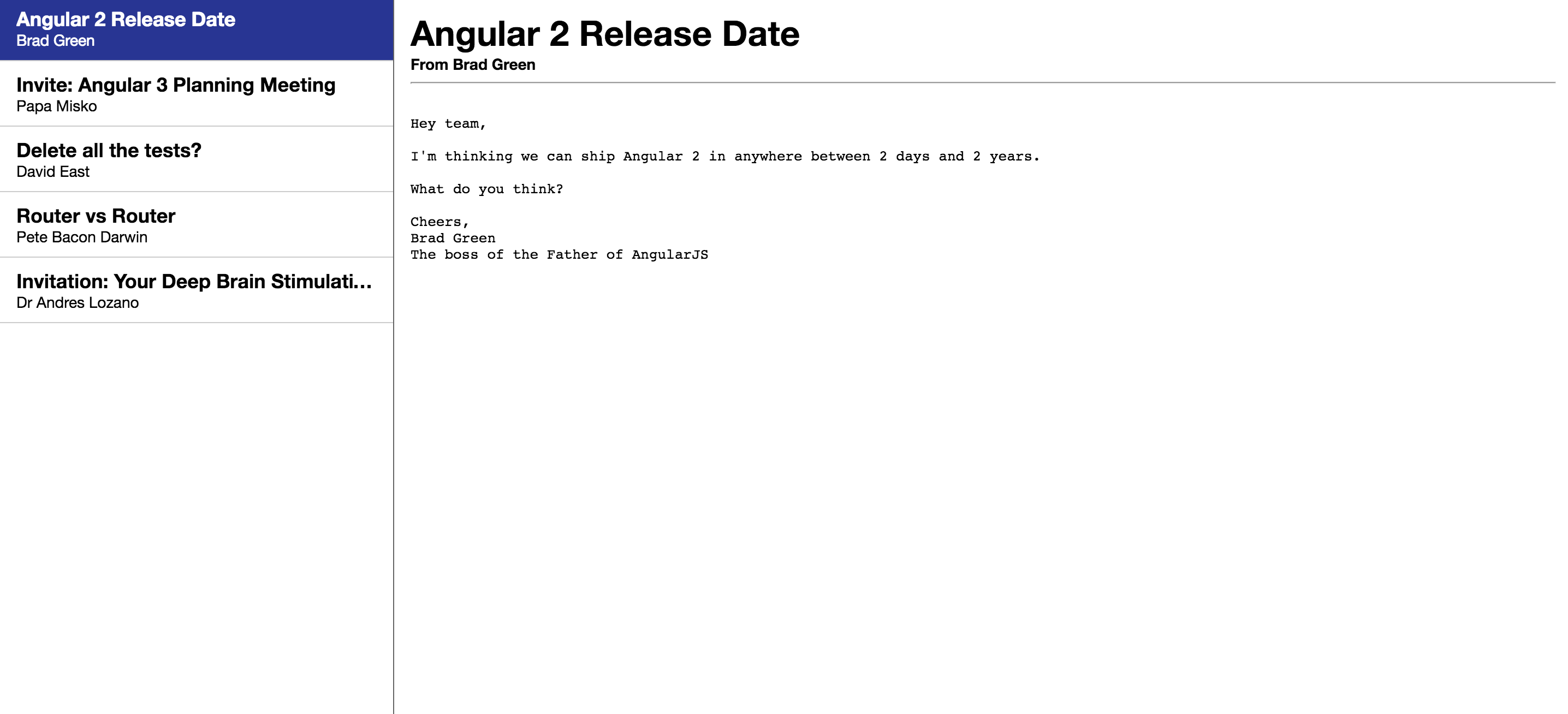
<div class="left">
<div class="email-list-item"
*ngFor="let email of emails"
[class.active]="email === selectedEmail"
(click)="selectedEmail = email">
<div class="background"
@state="email === selectedEmail ? 'active' : 'hidden'"></div>
<h1>{{ email.subject }}</h1>
<h2>{{ email.sender }}</h2>
</div>
</div>
<div class="right">
<div class="email-full"
*ngFor="let email of emails"
@state="email === selectedEmail ? 'active' : 'hidden'">
<h1>{{ email.subject }}</h1>
<h2>From {{ email.sender }}</h2>
<hr>
<div class="email-body">
<pre>{{ email.body }}</pre>
</div>
</div>
</div>
@Component({
selector: 'my-app',
templateUrl: 'app/app.html',
animations: [
animation('state', [
state('void', style({ display: 'none' })),
state('active', style({ transform: 'translate3d(0, 0, 0)' })),
state('hidden', style({ transform: 'translate3d(100%, 0, 0)' })),
transition('active => hidden', [animate('350ms ease-out')]),
transition('hidden => active', [
style({ transform: 'translate3d(-100%, 0, 0)' }),
animate('350ms ease-out')
]),
]),
]
})
export class App {...}
Performance
No getComputedStyle
Web Animations integration
Code Generation
Web Workers
Web-Animations Polyfill
Use the w3c version today
https://github.com/web-animations/web-animations-js
Angular will have a lightweight version soon
https://github.com/angular/element-animate-polyfill
Styles Styles Styles
How can we apply style?
Is everything inline?
Can I use classes?
Keyframes?
Programmatic styling?
@Component({
// define your styling
styleUrls: ['animate.css'],
styles: [`
.visible { opacity: 0 }
.invisible { opacity: 0 }
`],
// define your animations
animations: [
animation('myAnimation', [
// inline styles
transition('state1 => state2', [
style({ opacity: 0 }),
animate('1s', [
style({ opacity: 1 }),
])
]),
// component CSS classes
transition('state2 => state3', [
style('.invisible'),
animate('1s', [
style('.visible'),
])
]),
// component CSS keyframes
transition('state4 => state5', [
animate(1000, style('@fadeIn'))
]),
// programmatic keyframes
transition('state5 => state6', [
animate('1000ms ease-out', [
style({ transform: 'scale(0)', offset: 0 }),
style({ transform: 'scale(1.5) rotate(100deg)', offset: .33 }),
style({ transform: 'scale(0.5) rotate(-80deg)', offset: .66 }),
style({ transform: 'scale(1) rotate(0deg)', offset: 1 })
])
])
// auto-computed styles
transition('state6 => state7', [
style({ height: 0 }),
animate('1000ms ease-out', [
style({ height: '*' })
])
])
])
]
})
2
Automatic Styling
Any CSS property can be used
Just use a * value
this would be very hard normally
@Component({
animations: [
animation('active', [
state('closed', style({ height: 0 })),
state('open', style({ height: '*' })),
transition('closed => open', [ animate('350ms ease-out') ]),
transition('open => closed', [ animate('350ms ease-out') ])
])
]
})
But where’s the JS code?
It's best to just use styles
Or create your own driver
But you can always return a promise
// apply dynamic properties
animate('1000ms', [
style('.modal-styles').transform('clickXY')
])
// registered elsewhere
function clickXY(element, styles, triggerEvent) {
styles.top = triggerEvent.clientY;
styles.left = triggerEvent.clientX;
return styles;
}
// apply dynamic properties
animate('1000ms', [
style({ 'top': '[randomValue()]' })
])
class MyCmp {
randomValue() { return Math.random() }
}
query, grouping, easing...
we can select individual elements
group them together
3
@Component({
style({ opacity: 0, transform: 'scale(0)' }),
query('.section', [
style({ opacity: 0, transform: 'scale(0.8)' })
]),
// animate multiple elements in parallel
group([
// animate the container
animate('800ms 0ms cubic-bezier(0.68,-0.55,0.265,1.55)', [
style({ opacity: 1, transform: 'scale(1)' })
]),
// fetch inner items
query('.section', [
style({ opacity: 0, transform:'scale(0.8)' }),
animate('300ms 100ms ease-out', [
style({ opacity: 1, transform:'scale(1.2)' })
])
animate({ transform:'scale(1)' }, '300ms ease-out')
])
])
})
Staggering
full support
linear, reverse...
DOM specific
Create your own
//
// Query and Stagger together...
//
query('[ngFor]', [
style({ opacity: 0 })
stagger(100, [
animate('1s', [
style({ opacity: })
])
])
])
// apply dynamic properties
query('[ngFor]', [
stagger('100ms customStagger', [
animate('1000ms', [
style('.some-class')
])
])
])
// registered elsewhere
function customStagger(element, styles, triggerEvent, total, index) {
return someDelayValue;
}
4
Component Access
Components + Animations
components can access animations
for listening on status
or for programmatic control
class MyCmp {
@AnimationControl('animationName') ani;
ngOnInit() {
this.ani.done.subscribe(() => {
// when an animation finishes
})
}
}
class MyCmp {
@AnimationControl('animationName') ani;
setPosition(p) {
this.ani.activeAnimation.setPosition(p);
}
}
5
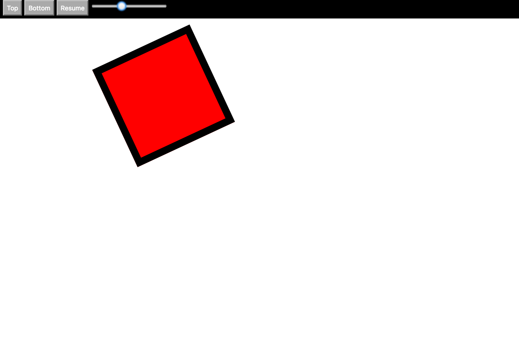
transition('top => bottom', [
style({ 'background': 'red' }),
animate(5000, [
style({ 'background': 'blue', 'transform':'scale(1)' }),
style({ 'transform': 'scale(1.5)', 'top':'200px' }),
style({ 'transform': 'rotate(125deg)', 'left':'400px' }),
style({ 'top':'400px', 'left':'400px', 'background': 'red', 'transform': 'scale(1)' })
])
])
Custom Renderers
Non-DOM Platforms
We added an animate() method
More platforms can jump in
class MyRenderer implements Renderer {
animate(element: any,
startingStyles: AnimationStyles,
keyframes: AnimationKeyframe[],
duration: number,
delay: number,
easing: string): AnimationPlayer {}
}
NativeScript!
When’s it coming out?
Thank you guys!
thank you
Matias Niemela
@yearofmoo
Robert Messerle
@Bobbo_O
yom.nu/ng-conf-2016-slides
github.com/matsko/ng-conf-demos